Thursday, December 10, 2009

Blog #13


In the spirit of finals week, here is a kit for you to use.
Illustration of a stress reduction kit


Top 10 Web Design Trends for 2010


  1. Typography
    This trend started over the past year and will continue. Designs will trend toward the use of typography an integral part of the overall work rather than a liability. Web designers will start using larger, more exciting fonts in place of system text. Overall, designers are paying closer attention to typographic details such as leading, line height and choice of font. Example
  2. Sketches, hand drawn style and illustrations
    Easily noticeable on a page. Stands out from traditional graphics and gives the website a unique, personalized look. Example
  3. Large images/photography is one that I listed last week. It is expanding super fast and is a quick way to network. You can get a lot of visitors to your site from Twitter. It will help you give your business exposure. Example
  4. Magazine Layout
    With more people going on line who see the web as the source of entertainment and real time information, many sites will be gearing towards this type of look - with short concise articles that are easy to read and concise information. Example
  5. Introduction Blocks
    The upper-left area of a website is the most important block on the page, because that is the first place your eye goes when you come to a website. This spot grabs most attention from visitors. Therefore, this is the ideal place to get your message out and seen quickly.
    You see this done in many types of design, including corporate design, web apps, or portfolios. They take up alot of real estate, but that is ok. the message is key. Example
  6. Single Page Layouts
    People are in a rush, they are online to find the info and go, they dont have time to look around and see everything. This is the solution to get them the info they need. Example
  7. Social Media Sites and Add-ins/Icons
    Of course this has been the big thing of the past two years, and it will only continue to get bigger. Linking to them, using apps from them helps build communities around products, ideas and causes. More and more people are spending time online, looking to connect with like minded people and to share their lives and information. Sometimes too much information. Example
  8. White Space
    Its cleaner, easier on the eyes and easy to find what you are looking for. White is a great color to help something stand out…except if its the carpet under your dining room table. Sometimes simplicity is key. Example
  9. Icons and Visuals
    Not talking about clip art, but stylistically rendered icons that represent in a small image what the entire section is about. Easy for people to recognize and people notice them quicker than text. Example
  10. Modal Boxes (Lightboxes) These guys are great. Open source applications that are, basically the next generation of pop-ups. They are a cleaner, more user-friendly alternative to the basic JavaScript pop up windows that have been around for years. Clean, crisp, and focuses the user on the information you are presenting, whether it is a picture, text or a video. This little tool helps the presentation go a long way. Example

Research other great info like this at Design Tuts.


Tid Bits

  • Reminder: When mocking up your site in Photoshop your settings should be: width=960px, wide, RGB, and 72 DPI.
  • Do not assume: Because your own strength is unequal to the task, do not assume that it is beyond the powers of man; but if anything is within the powers and province of man, believe that it is within your own compass also.
    Marcus Aurelius
  • Quote to live by"In art the hand can never execute anything higher than the heart can inspire."
    Ralph Waldo Emerson

Useful Web Sites


  • Throughout my posting process I am constantly researching and coming across many links that are helpful and even some that are not. In addition to your own research it is also a great idea to ask fellow designers about what sites they like to visit as well.

    picture of Detonation films
  • The first one is Webshots. This site is pretty sweet because it to download photos from pros. You just have to become a member first.
  • Another site for those of you interested in digital video is Detonation. This is a site that provides free clips for special effects.

In Other Graphic Design News


This first site I found while looking for future trends in web design FOWD It is a site based upon the premise of the future of web design. There are videos of designers speaking on different aspects of web design that you can watch.


For you photographers and graphic designers out there I learned about a site in Intermediate photography that lets you make these cute little business cards. These are great because you can just sprinkle them about and leave them in places for people to pick up (because they are so cute). Visit MOO.


A lil side note: If you are interested in making a little book as a family gift this christmas just visit Blurb.

Wednesday, November 18, 2009

Blog #12


turkey holding an eat beef sign


Conditional Comments and Networking


Conditional comments are conditional statements interpreted by Microsoft Internet Explorer in HTML source code. Conditional comments first appeared in Microsoft's Internet Explorer 5 browser and are supported through at least version 8.[1]
Conditional comments can be used to provide and hide code to and from Internet Explorer.
There are two types of "conditional comment", downlevel revealed, and downlevel hidden. Examples of code and more info is available at WIKI.


Benefits of Using Conditional Comments

Conditional comments have certain advantages over scripting methods of browser detection.

Low client-side impact.
When a downlevel browser encounters a downlevel-hidden conditional comment, the browser skips over the HTML inside the comment, and the content elements are not parsed, downloaded, or rendered. This saves client machine resources.

No script required.
Conditional comments do not require scripting and DHTML, and when no scripting is used in a Web page, no scripting engine needs to be loaded. Conditional comments are processed during the downloading and parsing phase, so only the content that is targeted for the browser is actually downloaded. Conditional comments can be combined freely with other browser detection techniques.

Separate code from detection logic.
Using conditional comments, script logic can be separated into smaller and simpler segments of code, which are easier to maintain and understand. Plus, code segments are loaded only by the browser version for which they were intended.

Cross-browser.
Conditional comments have been around since Internet Explorer 5, but their use is not restricted to Internet Explorer alone. Conditional comments can be used to customize content delivered to browsers that support conditional comments and those that do not. Get more info right HERE.


Networking Tip: Web designers and copywriters have a lot in common:
We work with clients who need a website.
We help clients who don't know how to start a website.
We offer individual creative services. I know – obvious tip – but they have corporate clients who are willing and ready for referrals. If you don’t like networking or cold calling, copywriters do both with very successful results. Find some copywriters and ask them what kind of design requests they get from their clients. Start the discussion now and clients will follow. Additional specs can be found HERE.


pen with keyboard


Tid Bits


  • Reminder: Marketing s a "social and managerial process by which individuals and groups obtain what they need and want through creating and exchanging products and values with others." This definition obtained at WIKI.

  • Do not assume; ASK! #14--Don't think the colour is right on your screen.. it's not, check a reference. More listed at Funny.

  • Quote to live by""What garlic is to food, insanity is to art." -- Unknown


Useful Web Sites


  • Throughout my posting process I am constantly researching and coming across many links that are helpful and even some that are not. In addition to your own research it is also a great idea to ask fellow designers about what sites they like to visit as well.

    picture of web canvas


  • The first one Jesh had mentioned in our reference list earlier; Methodologie. This site is pretty sweet because it shows you web canvas sizes and the percentage of people that can see in each size. This is a cool tool to check out for our upcoming new website.


  • Another site he mentioned that will be helpful for our Photoshop layout is 1st Web. This is a site that has a list of the 90 New and High Quality Photoshop Web Layout Tutorials. Crazy sick knowledge at your fingertips folks!


In Other Graphic Design News


This first site I found while looking for the latest and greatest in Graphic Design. It is an article that was published after interviewing 20 designers. It sums up how these designers charge their clients. Its interesting to find out how different designers charge.


For you photographers out there I came across a site that has some interesting tutorials and information that you might find useful. DPS or Digital Photography School has interesting articles on How to photograph a rainbow, composition tips and photo challenges. I highly encourage checking it out just for fun.


A lil side note: If you are interested in some Thanksgiving wallpapers just visit this site.
happy thanksgiving Have a very Happy Thanksgiving!

Thursday, November 12, 2009

Blog #11


veterans day illustration


Web Apps


There are a ton of applications out there and more hit the internet everyday. I found a site that lists the top ten apps for 2009 and I thought I would share them with you.


  1. Dropbox is a tool that lets you drag and drop files into your Dropbox and then archives them online. This is useful if you don't have a file or image with you while you are on the go. You can just tap into your Dropbox and access your files. Fantastic for showing someone updated designs or roughs.


  2. Crazy Egg is an analytic tool that can track what people do when on your site. It will show the info on different graphs and charts for your review. Always good to know what's clickin' chicken!


  3. Twitter is one that I listed last week. It is expanding super fast and is a quick way to network. You can get a lot of visitors to your site from Twitter. It will help you give your business exposure.


  4. Mail Chimp is an email marketing application that helps you create and control email lists. It can also help you create email campaigns in html and review marketing.


  5. Kuler I have mentioned before but it is a great color app that helps you find colors that mesh together well.


  6. Carbon Made gives freelancers an opportunity to display their graphic designs. They have over 165,000 portfolios on the site. That is a lot in case you were wondering!


  7. Freckle helps you track the progress of a project. It will show you when you were working, for how long and on what project.


  8. Icon Finder is an icon search engine that can assist you in locating specific icons. It will also show license and usage information before downloading.


  9. Type Tester is another one that I mentioned last week. It will let you try out different fonts side by side. You can can adjust different styles and see the results.


  10. PX to EM helps you understand text size and how it works in CSS. You type in your font size and it will convert it for you.


Research other great info like this at WEBDES.


4 cards stacked


Tid Bits


  • Reminder about the z-index rule. It is like dealing cards. The first one you deal out in your html is going to be on the bottom and they stack from there. However the z-index rule will help you to shuffle the order of your cards and stack them differently. I found a site that displays box elements and lets you change the z-index and position and then shows the results of your choices. Don't forget you have to use the position rule with the z-index for it to work.

  • Do not take anything for granted. It may not be there tomorrow.

  • Quote to live by"I am always doing that which I cannot do, in order that I may learn how to do it." Pablo Picasso


Useful Web Sites


  • Throughout my posting process I am constantly researching and coming across many links that are helpful and even some that are not. In addition to your own research it is also a great idea to ask fellow designers about what sites they like to visit as well. This week I've included a couple sites that Aaron suggested.

    appstorm lightening bolt


  • The first one he mentioned while I was searching for apps was Appstorm. This site is Mac based and gives general news and updates on applications as well as reviews, best of the best and even has how to's. Definitely check it out when you have a chance.


  • Another site he mentioned was Smoking Apples. This is a site that you can use to keep up to date on apps. It provides news and interviews. It has info for the Mac and iPhone and includes a Magazine page and Podcast.


In Other Graphic Design News


This first site I found while looking for the latest and greatest in Graphic Design News. It is just a simple and straight forward article that describes a work-day in the life of a freelance designer.


If you want to test your skills and knowledge of graphic design you can visit this site. There are three different games: The Font Game, the Logo Game and the Munsell Hue Test.


A lil side note: You may already know this but if you are on facebook you can become a fan of PSDtuts if you want. New tuts will then post to your wall when they come out on the web.

psd tuts

kid rock with usa guitar


Thursday, November 5, 2009

Blog #10


Progressive Enhancement


Progressive Enhancement is a strategy used in web design. It's emphasis is accessibility, semantic markup, and external stylesheet and scripting technologies. It utilizes web technology in a stacked order that lets people use the information and usefulness of a web page, utilizing any browser or internet connection. It also gives users with a better bandwidth or better software an improved view of the site.


This is meant to replace the graceful degradation of sites. Graceful degradation seemed to imply that the user should upgrade their software or browser. However this is not always possible and in progressive enhancement the mentality is pretty much the opposite of this idea. Progressive Enhancement utilizes html, with the the lowest common denominator of browser software functionality, and then tops it with usefulness or extras to the prettiness and behavior of the page. This is done by the use of CSS or JavaScript (or others). Almost all are linked from the outside so that browsers with less ability can avoid gobbling up data that is not recognized or would overload the connection. Research further info at Wiki. Found this illustration by Dave Stewart on-line. He also provides an excellent explanation of the overall process based on the diagram of Candy.


3 layers shown as candy


Sucker fish navigation is a type of code or script used to make the :hover pseudo class work in Internet Explorer. In internet Explorer this pseudo class only works with links. There are many sites that explain this but I have been to many and am still working towards finding a better explanation. The info I have provided can be ound by goin fishin.


As we are learning CSS and making everything look good we also need to consider typography and how it will be displayed on various browsers. I located a site that will show you how type compares across different screens.
As new fonts are bundled into operating systems, the list of common fonts is updated. Also another key ingredient in our web site will be the navigation bar. I came across a cute little site that shows 45 Inspiring Navigation Menus That You Must See.3 layers shown as candy


Tid Bits


  • Reminder about the list of resources that Jesh provided earlier in the semester. One of the sites he had mentioned was themeforest. Right now there is an article on image types and usage in web design.

  • Do not underestimate the power of food or a break. You not only need to understand yourself as a designer but what keeps you going. You need to recognize when you need to step away from a project and let it rest in the back of your mind. Also, both our brain and our body need nourishment to flourish and operate fully. The brain and the body work hand in hand and the sooner you understand how yours works the more creative and productive you can be.

  • Quote to live by"Life beats down and crushes the soul, and art reminds you that you have one." Stella Adler


Useful Web Sites


  • Throughout my posting process I am constantly researching and coming across many links that are helpful and even some that are not. In addition to your own research it is also a great idea to ask fellow designers about what sites they like to visit as well. This week I've included a couple sites that Jesh suggested.

    twitter icon

  • I'm sure everyone knows about twitter but did you know that you could follow some of the greatest designers in the world? The following is a list of Jesh's web heroes that he follows on twitter.

  • Another site he mentioned was copy paste character. This is a site that you can use while marking up your html. If you forget a special character you can just visit this site and click on the As HTML button then copy and paste it into your document.


  • One last site useful for our graphic design is kuler. This site is all about color and creating your color palette for a project. There are endless possibilities and you can't possibly know them all so check it out.


In Other Graphic Design News


This first site I found while looking for the latest and greatest in Graphic Design News. It is an on-line site dedicated to Graphic Design in the USA. The latest issue is November 2009 and has links to current issues and past issues as well as a gallery of design work.

GD USA magazine with many photos on it


I also love to promote my brother; not only because we are related but I know he is extremely talented. He is well versed not only in the world of graphic design but music as well. If you would like to check out his music please visit sevendsix He creates his own music and does remixes of other artist's work. You can also become a fan on facebook if you would like. One of my latest favorite remixes is one originally done by Avalon Omega. Sounds tons better than the original! You can also visit youtube and do a search for seven d'six.

Thursday, October 29, 2009

Blog #9


cartoon witch on broom, says happy halloween


sIFR


sIFR is short for Scaleable Inman Flash. It has been designed to replace small pieces of plain browser text with text created in the typeface of your choice, whether or not the user has the font installed in their computer. It is able to to do this by using a combo of javascript, CSS, and Flash. Below is how it works:


  1. A normal (X)HTML page is loaded into the browser.

  2. A javascript function is run which first checks that Flash is installed and then looks for whatever tags, ids, or classes you designate.

  3. If Flash isn’t installed (or obviously if javascript is turned off), the (X)HTML page displays as normal and nothing further occurs. If Flash is installed, javascript traverses through the source of your page measuring each element you’ve designated as something you’d like “sIFRed”.

  4. Once measured, the script creates Flash movies of the same dimensions and overlays them on top of the original elements, pumping the original browser text in as a Flash variable.

  5. Action script inside of each Flash file then draws that text in your chosen typeface at a 6 point size and scales it up until it fits snugly inside the Flash movie. Check more info at sIFR or from Wiki.


sifr illustration


Considering we have to count words sometimes (to include the amount in our weekly blogs or placed in our web site), I found a place on-line that will count your words for you. You simply just cut and paste your info in the window and hit submit.


As we are learning CSS and making everything look good we also need to consider how users will navigate through our site with ease (hopefully). I located five basic rules to navigate by:


  1. Navigation Should Be Easy to Find (Very Easy): usually at the top and should be obvious/stand out.

  2. Keep it Consistent: Should be in the same location throughout the site.

  3. Use Obvious Section Names: Be as specific as possible.

  4. Less is More: Keep it simple; don't add too many choices.

  5. Remind the User Where They Are: use a consistent method to highlight the section they are in.


I obtained this info at about.
I also found a site that contains some great tutorials for creating friendly interactive navigation. Just go to Nav for more info and tuts.


drawing of a bat


Tid Bits


  • Research, research, research reminder. Always good to learn from famous graphic designers. I found some of these names while researching. Tschichold, Scleger, Rand, Fletcher, Aicher, Muller-Brockmann; to name a few related to typography.

  • Do not chew gum while cliff diving or snorkeling. It can have some ugly results.

  • Quote to live by"Any activity becomes creative when the doer cares about doing it right or better." John Updike


Useful Web Sites


  • Throughout my posting process I am constantly researching and coming across many links that are helpful and even some that are not. In addition to your own research it is also a great idea to ask fellow designers about what sites they like to visit as well. This week I've included some halloween design sites.

    photos of scary faces

  • I'm sure everyone has their favorite site for brushes but here is one I found while looking for hair brushes. The cracked brush set is awesome and just in time for Halloween if you want to doctor one of your photos (or one of your friends photos). Pretty Scary!

  • Another site I found was scary psd tutorials. It is not for the squeamish though. There are tutorials as well as brushes too.


  • One last site useful for our web design is this one. It lets you pick a background color and see text/link colors and preview each choice.


In Other Graphic Design News


This first site was cracking me up. It shows a bunch of photoshop mistakes that were made and not only that they were published. Mistakes that obviously could have been avoided.

before and after photo mistake


I also found a website that has a ton of scary Halloween content. The graphic designer at Rogues Hollow Productions have a very haunted. portfolio. Those of you who are currently taking typography may do pretty well and end up in the Hall of Fame.

Thursday, October 22, 2009

Blog #8


Acronyms and Reminders


SVG is a scaleable vector graphic and is a text based graphics
language that describes images with vector shapes, text, and embedded raster graphics. SVG files are small and give high-quality graphics on the Web, print material and on mobile devices. Also it supports scripting and animation; great for interactive, data-driven, personalized graphics. Check more info at Adobe.


Graceful Degradation is the property that enables a system (often computer-based) to continue operating properly in the event of the failure of (or one or more faults within) some of its components. If its operating quality decreases at all, the decrease is proportional to the severity of the failure, as compared to a naively-designed system in which even a tiny failure can cause total meltdown (from Wiki). In other words design for flexibility. Make sure your content is accessible without images, scripts, applets, and plug-ins.
cartoon CSS, XHTML, JAVAScript


JavaScript is apparently THE scripting language of the Web. It is one of the most popular programming languages on the web. It has had widespread success as a client-side scripting language for web pages. It adds functionality, validates forms, detects browsers and much more. It was released in 1995 and is the behavior side of code. For more information visit W3 or Wiki.


Considering we are about to take our Midterm test, I thought I would review some of the things that I obviously misunderstood the first time around and share the correct info with you. A quick refresher helps keep things straight.


  1. Front end processes happen on the visitors computer and Back end processes happen on the server.

  2. www.browsershots.org is a site you can use to see how code is rendered in different browsers.

  3. Attributes for form controls: Single Line Text Entry = text, File Upload = file, Checkbox Button = checkbox, and Multiple Selection Box = multiple.

  4. Three additional buttons in HTML are image, button, and button element. There are also submit, reset, checkbox, radio, browse, and pull-down.

  5. URL stands for Uniform Resource Locator (or URI-identifier). It is made up of 3 parts. These are the protocol, site name, and absolute path.


Tid Bits


  • Practice what you Preach reminder. Realized that I provided info last week about being attentive in class and realized that I did not follow my own advice during last weeks session. Note to self: Pay attention to yourself. Note to Jesh: My bad; sorry.

  • Do not use more than three different fonts in one piece of design. It may look too busy and confuse the message for the viewer.

  • Quote to live by"Genius is nothing but a great aptitude for patience" George_Louis De Buffon


Useful Web Sites


  • Throughout my posting process I am constantly researching and coming across many links that are helpful and even some that are not. In addition to your own research it is also a great idea to ask fellow designers about what sites they like to visit as well. This week I obtained a couple new ones from Mario.

    red wax seal with the secret spelled out

  • If you are creating a logo be sure to visit FlippingTypical. This site is awesome because it allows you to type in your text and then it will proceed to show you how it will be rendered in each font that you currently have loaded. This is much easier because you can see them all at one time as opposed to just clicking on one to see how it works out.

  • Another site he mentioned was WhatTheFont. Now I am pretty sure I have heard about this site before but what I did not know was that they have an app for this site. Now you can take a picture of the font you are looking for instead of scanning it into the computer. Way Cool! Thanks Mario.


In Other Graphic Design News


This first site I came across when I was trying to find a cartoon for acronyms. It is just a fun site which reviews some of the Worst Email Mistakes made by various people in the business world.

cartoon of man frustrated in front of computer


I also found a website that has a font game on it. Rather it is more like a test but challenging none the less. It is Font Game. Those of you who are currently taking typography may do pretty well and end up in the Hall of Fame.

Thursday, October 15, 2009

Blog #7


Style


Style has finally arrived! Woo–Hoo!CSS is going to be so
rewarding as graphic designers.

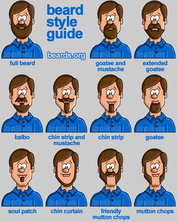
Just as facial hair can be styled in many ways, your web site can be styled in even more ways.


cartoon of different beard types


CMS


CMS is not what you are thinking but rather a content management system. CMS is a computer application utilized to oversee work flow needed to jointly create, edit, review, index, search, publish and archive various kinds of digital media and electronic text. CMSs are mostly utilized for storing, controlling, versioning, and publishing company specific information such as news articles, manuals, guides, and marketing brochures.


The elements overseen may be computer files image media, audio, video, and web content. CMS is also just like DMS, document management system which is a computer system used to track and store electronic documents and/or images of paper documents. DMS can be very small or very large for huge companies. Most methods for managing include location, filing, retrieval, security, recovery, retention, archiving, distribution, workflow, creation, authentication and traceability.


There are many different names for this area of work and Web CMS is one of them. WCM or web content management system is a CMS geared to ease the publication of web content to sites, specifically, allowing content creators to submit content without requiring technical knowledge. More info can be found at Wiki.


Tid Bits


  • Elements of an Ad include the visual, a headline, body copy, tagline and the sign–off.
    The visual is just that the image or combination thereof that grabs the viewer. The headline is the
    main message that is conveyed usually at the the top. The body copy is the info
    that supports the over all message. The tagline is the theme or spirit of the
    campaign. Finally, the sign–off includes the logo or photo of the brand ore even both.
    All of this information can be accessed in chapter 11 of our Graphic Design
    Solutions book. Always a good reference for design.

  • Be attentive and actually pay attention to not only your
    teachers but your peers as well. Acknowledge your listening and understanding
    with eye contact and nod your head occasionally. Ask questions and also provide
    constructive feedback as well. Everyone is spending both time and money to
    be here so it should be spent wisely.

  • Do not chew gum during an interview. Also, be sure that you don't
    drink too much coffee or energy drinks prior to either. It may have the
    opposite effect you want.

  • Quote to live by "Furious activity is no substitute for understanding."
    -- H.H. Williams, Oakland, California.


Useful Web Sites


  • Throughout my posting process I am constantly researching and coming across many links that are helpful and even some that are not. In addition to your own research it is also a great idea to ask fellow designers about what sites they like to visit as well.


  • I am sure all of you know about PSDtuts already but I just thought I would
    let you know that they have some international works posted on the site right now
    and they are amazing. Be sure to check it out. It is Awesome!


  • Another one I came across was Textures. This site has a ton of different textures and
    backgrounds available for use. And the best part is that they are free. The two shown below were found on this site. Be sure to read
    the information about redistribution because you are not allowed to sell
    the textures even if you make changes.


    x–ray of a hand
    photo of bamboo


In Other Graphic Design News


This first site I came across when I was doing a search on unconventional advertising
ideas. This reminded me of the Red Shoe Fundraiser that Philippe spoke to us about. The artist that is featured is Michel Tcherevkoff. He creates these amazing botanical shoes
utilizing both photography and Photoshop.


I also found a website that provides a collection of sites providing free
web icons, buttons, and flags even. It is Technacular. This site was created by Vikas Sah, a techie who just loves to share information and knowledge with others (kind of like us right now).


different icon buttons


Check out this hilarious t–shirt that I found.

shirt that says bad spellers untie